

Design UI Diagram
They define structure, logic, and often the scope of development work. A good diagram clarifies thinking. A poor one creates confusion — for both designers and developers. Below are practical rules to keep diagrams clear, scalable, and buildable.
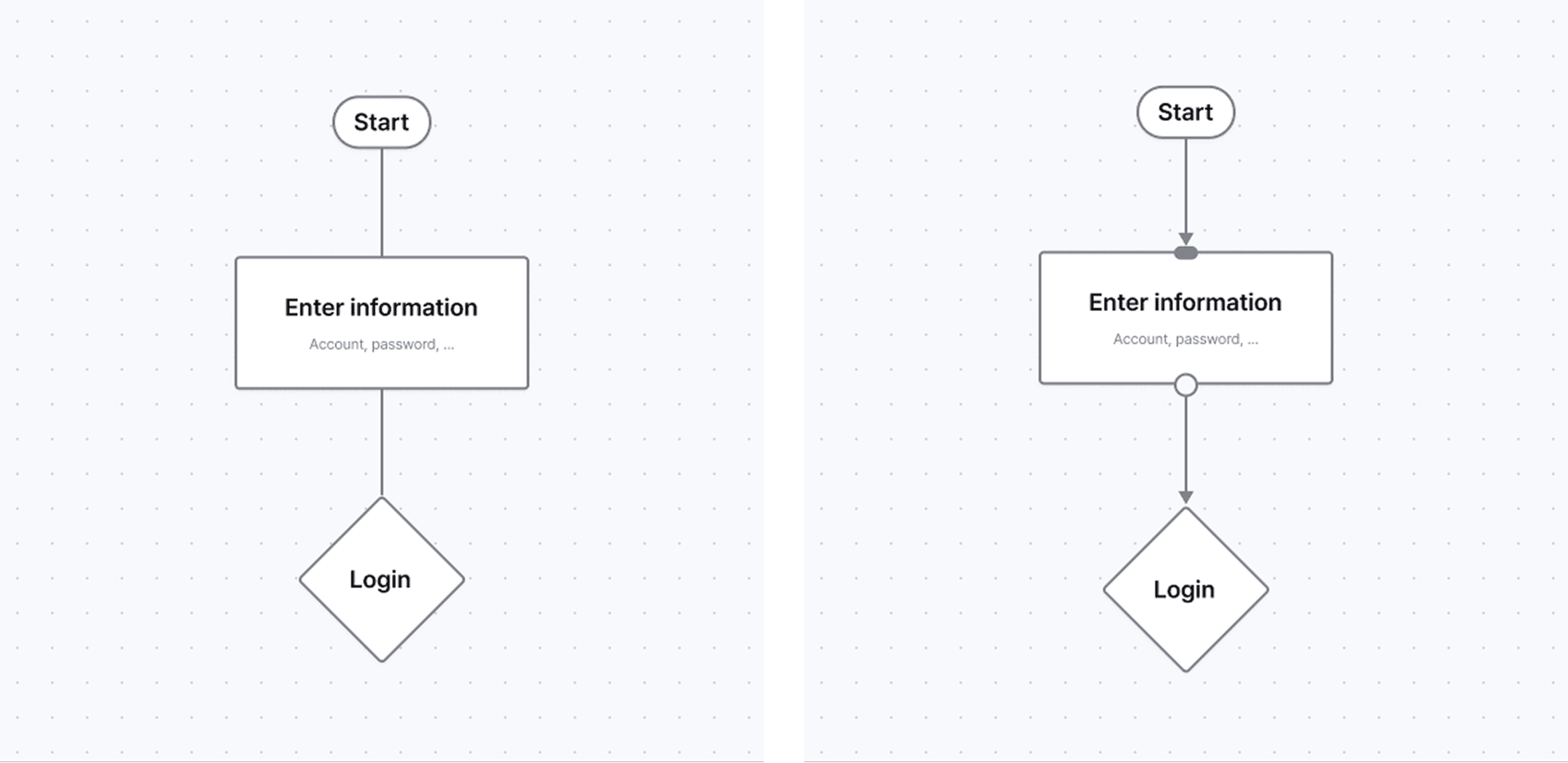
Define Inputs and Outputs Explicitly
Every node must answer two questions:
What goes in?
What comes out?
Rules:
Inputs enter from one consistent side (left or top)
Outputs exit from the opposite side (right or bottom)
Arrows always indicate direction clearly
If a node’s inputs or outputs are unclear, its responsibility is unclear.
(Visual idea: simple node with labeled input/output arrows)
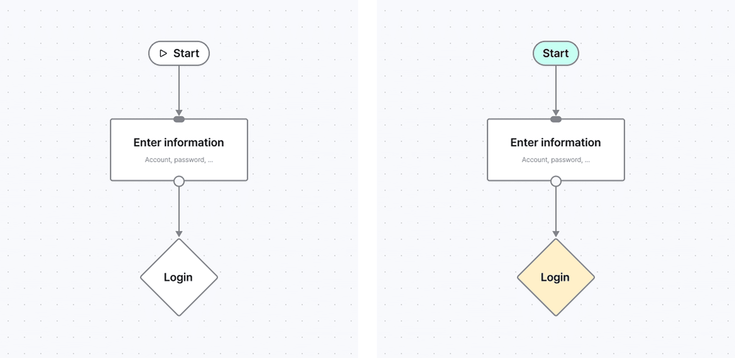
2. One Node - One Meaning
A node should represent one type of thing:
A user action
A system process
A decision
A state
Differentiate nodes using:
Icons (function)
Color (category or ownership)
Text (description)
Choose one primary method.
Note :Avoid mixing icon + color + shape without rules. (Visual idea: 3 node types with consistent styling)
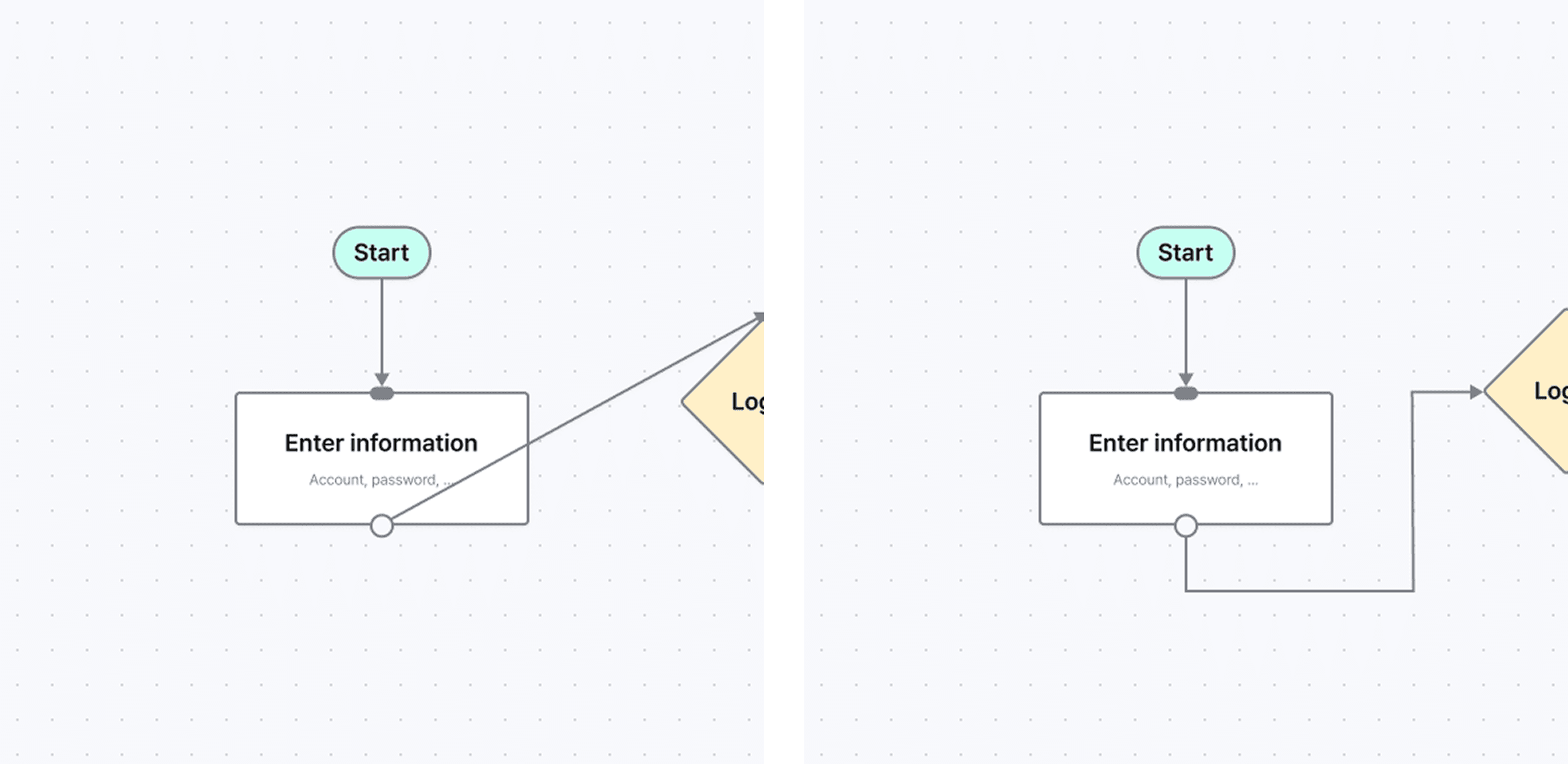
3. Handle Overlapping and Crossing Carefully
Crossing lines and overlapping nodes usually indicate structural issues.
Before fixing visually, ask:
Can this flow be simplified?
Should this be split into smaller diagrams?
If overlap is unavoidable:
Use layering
Fade secondary paths
Separate sections clearly
Visual clarity should reflect logical clarity.
(Visual idea: messy vs cleaned-up flow)
4. Respect Development Effort
Diagrams are often read by developers as intent.
Every branch implies logic.
Every state implies handling.
Design with intention:
Avoid unnecessary edge cases
Prefer reusable patterns
Introduce complexity progressively
If it appears in the diagram, it is likely to be built.(Visual idea: optional flow marked as dashed line)
Bloom EVERYDAY